The curious case of equidistant boxes, a CSS fail

The above is not an exercise in geometric abstraction. It’s an attempt to do something seemingly simple, but to the best of my knowledge, impossible in CSS. The challenge is this:
Given a container, fill the container with n items of variable width, with the leftmost item flush with the left border, and the rightmost item flush with the right border, and an equal amount of space between each.
Unpossible! Try it.
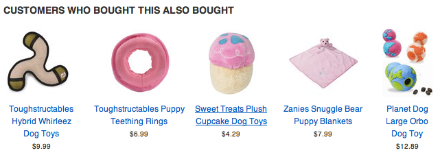
This isn’t a contrived example. Being a pixel pedant, when we started in on our app for Shopify, where images may be any size within a bounding square, distributing them equidistantly seemed The Thing To Do. Here’s a shot from our test shop with the items properly distributed and the text properly centered under them:

So, let’s step through the options:
.container { border: 1px solid #333; width: 520px; margin-bottom: 1em; } .container ul { padding: 0; margin: 0; } .container ul li { margin: 0; padding: 0; display: inline; } |
<div class="container">
  <ul>
    <li><img src="80.png" /></li>
    <li><img src="100.png" /></li>
    <li><img src="80.png" /></li>
    <li><img src="100.png" /></li>
    <li><img src="60.png" /></li>
  </ul>
</div> |

That gives us the first box, things are messily clumped along the left side of the container. I quickly threw in the towel and went for a table. With a table it was easy to get things distributed evenly, but with ragged extreme borders:
table.container { width: 522px; border-spacing: 0; } .container td { text-align: center; padding: 0; margin: 0; } |
<table class="container">
  <tr>
    <td><img src="80.png" /></td>
    <td><img src="100.png" /></td>
    <td><img src="80.png" /></td>
    <td><img src="100.png" /></td>
    <td><img src="60.png" /></td>
  </tr>
</table> |

But if we want to make the extremities flush, we’re stuck with a larger-than-mean gap between the first two and last two boxes:
.flush td.first { text-align: left; } .flush td.last { text-align: right; } |
<table class="container flush">
  <tr>
    <td class="first"><img src="80.png" /></td>
    <td><img src="100.png" /></td>
    <td><img src="80.png" /></td>
    <td><img src="100.png" /></td>
    <td class="last"><img src="60.png" /></td>
  </tr>
</table> |

It turns out that the only way to do this seemingly simple task is to compute the margins ourselves and set them via Javascript. Here we take a table just like our second one, but with a “adjust” ID so that we can find it easily:
function adjust(id) { var table = document.getElementById("adjust"); var row = table.firstElementChild.firstElementChild; var cells = row.children; var totalImagesWidth = 0; for(var i = 0; i < cells.length; i++) { var image = cells[i].firstElementChild; totalImagesWidth += image.offsetWidth; } var extra = row.offsetWidth - totalImagesWidth; for(var i = 0; i < cells.length; i++) { var image = cells[i].firstElementChild; var padding = extra / (cells.length - 1); var buffer = Math.floor(padding * i) - Math.floor(padding * (i - 1)); if(i == 0 || i == cells.length - 1 && cells.length >= 2) { cells[i].style.textAlign = ((i == 0) ? "left" : "right"); cells[i].style.width = (image.offsetWidth + Math.floor(buffer / 2)) + "px"; } else { cells[i].style.textAlign = "center"; cells[i].style.width = (image.offsetWidth + buffer) + "px"; } } } if(window.addEventListener) { window.addEventListener("load", adjust, false); } else if(window.attachEvent) { window.attachEvent("onload", adjust); } |

Now things get adjusted just as we’d want them. Let’s walk through the steps:
var table = document.getElementById("adjust"); var row = table.firstElementChild.firstElementChild; var cells = row.children; |
Here we just get a handle to our building blocks, the table, row and cells.
var totalImagesWidth = 0; for(var i = 0; i < cells.length; i++) { var image = cells[i].firstElementChild; totalImagesWidth += image.offsetWidth; } |
Now we compute the total width of all of the images used in the table. We’ll use that to figure out how much left-over space we have to distribute:
var extra = row.offsetWidth - totalImagesWidth; |
From there we go in to assign this to each cell:
for(var i = 0; i < cells.length; i++) { var image = cells[i].firstElementChild; var padding = extra / (cells.length - 1); var buffer = Math.floor(padding * i) - Math.floor(padding * (i - 1)); |
The padding is simply the extra space divided by the number of gaps that we have, but we compute the buffer for each iteration so that all of the left over pixels don’t accumulate at the end — i.e. if we had 7 items and the space between each should be in theory 10.333… pixels, that would leave us with 3 extra pixels stuck into the last gap. By doing the floor of each iteration and subtracting the previous value, we end up with appropriately distributed spare pixels.
if(i == 0 || i == cells.length - 1 && cells.length >= 2) { cells[i].style.textAlign = ((i == 0) ? "left" : "right"); cells[i].style.width = (image.offsetWidth + Math.floor(buffer / 2)) + "px"; } else { cells[i].style.textAlign = "center"; cells[i].style.width = (image.offsetWidth + buffer) + "px"; } } |
The second half of the loop just sets the cells at the extremities to be left / right aligned and gives each cell half of the buffer space for each of their internal gaps. The ones on the edges only need half of the buffer allocation since they don’t have a buffer on their outside edges.
The sad thing is this is actually a much simplified version of the real code. The real code also accounts for:
- Centering text under these images (Sounds easy right? No. You have to compute the margins manually also.)
- Dealing with stylesheets where images have margins, padding and borders and still making the right thing happen.
- Only one item being shown.
- Minimum sizes for images, centering them if they’re smaller (you don’t want to try to center text below a 5 pixel wide image that’s right aligned)
I can get into the mechanics of those in another post if necessary and have been considering stripping the real implementation out of our widget and throwing it up on Github where it can take a nice, clean JSON structure and turn it into a table of images, text, prices and links. Give a holler in the comments if you’d find such useful.
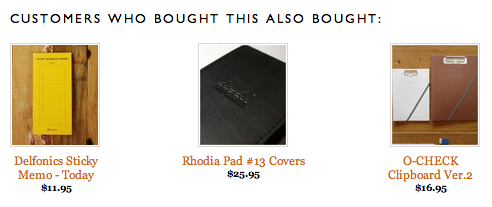
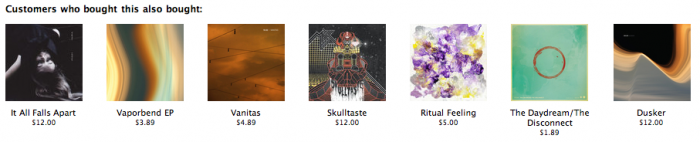
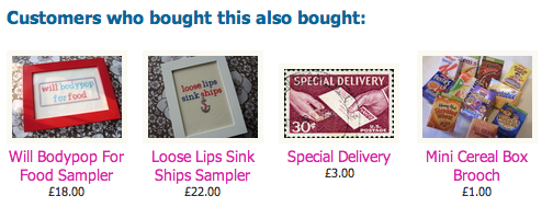
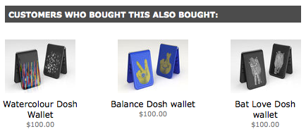
And with that, I’ll leave you with a gallery of what-this-looks-like-in-real-life shops, from the annals of our Shopify customers.