The curious case of equidistant boxes, a CSS fail

The above is not an exercise in geometric abstraction. It’s an attempt to do something seemingly simple, but to the best of my knowledge, impossible in CSS. The challenge is this:
Given a container, fill the container with n items of variable width, with the leftmost item flush with the left border, and the rightmost item flush with the right border, and an equal amount of space between each.
Unpossible! Try it.
This isn’t a contrived example. Being a pixel pedant, when we started in on our app for Shopify, where images may be any size within a bounding square, distributing them equidistantly seemed The Thing To Do. Here’s a shot from our test shop with the items properly distributed and the text properly centered under them:

So, let’s step through the options:
.container { border: 1px solid #333; width: 520px; margin-bottom: 1em; } .container ul { padding: 0; margin: 0; } .container ul li { margin: 0; padding: 0; display: inline; } |
<div class="container">
  <ul>
    <li><img src="80.png" /></li>
    <li><img src="100.png" /></li>
    <li><img src="80.png" /></li>
    <li><img src="100.png" /></li>
    <li><img src="60.png" /></li>
  </ul>
</div> |

That gives us the first box, things are messily clumped along the left side of the container. I quickly threw in the towel and went for a table. With a table it was easy to get things distributed evenly, but with ragged extreme borders:
table.container { width: 522px; border-spacing: 0; } .container td { text-align: center; padding: 0; margin: 0; } |
<table class="container">
  <tr>
    <td><img src="80.png" /></td>
    <td><img src="100.png" /></td>
    <td><img src="80.png" /></td>
    <td><img src="100.png" /></td>
    <td><img src="60.png" /></td>
  </tr>
</table> |

But if we want to make the extremities flush, we’re stuck with a larger-than-mean gap between the first two and last two boxes:
.flush td.first { text-align: left; } .flush td.last { text-align: right; } |
<table class="container flush">
  <tr>
    <td class="first"><img src="80.png" /></td>
    <td><img src="100.png" /></td>
    <td><img src="80.png" /></td>
    <td><img src="100.png" /></td>
    <td class="last"><img src="60.png" /></td>
  </tr>
</table> |

It turns out that the only way to do this seemingly simple task is to compute the margins ourselves and set them via Javascript. Here we take a table just like our second one, but with a “adjust” ID so that we can find it easily:
function adjust(id) { var table = document.getElementById("adjust"); var row = table.firstElementChild.firstElementChild; var cells = row.children; var totalImagesWidth = 0; for(var i = 0; i < cells.length; i++) { var image = cells[i].firstElementChild; totalImagesWidth += image.offsetWidth; } var extra = row.offsetWidth - totalImagesWidth; for(var i = 0; i < cells.length; i++) { var image = cells[i].firstElementChild; var padding = extra / (cells.length - 1); var buffer = Math.floor(padding * i) - Math.floor(padding * (i - 1)); if(i == 0 || i == cells.length - 1 && cells.length >= 2) { cells[i].style.textAlign = ((i == 0) ? "left" : "right"); cells[i].style.width = (image.offsetWidth + Math.floor(buffer / 2)) + "px"; } else { cells[i].style.textAlign = "center"; cells[i].style.width = (image.offsetWidth + buffer) + "px"; } } } if(window.addEventListener) { window.addEventListener("load", adjust, false); } else if(window.attachEvent) { window.attachEvent("onload", adjust); } |

Now things get adjusted just as we’d want them. Let’s walk through the steps:
var table = document.getElementById("adjust"); var row = table.firstElementChild.firstElementChild; var cells = row.children; |
Here we just get a handle to our building blocks, the table, row and cells.
var totalImagesWidth = 0; for(var i = 0; i < cells.length; i++) { var image = cells[i].firstElementChild; totalImagesWidth += image.offsetWidth; } |
Now we compute the total width of all of the images used in the table. We’ll use that to figure out how much left-over space we have to distribute:
var extra = row.offsetWidth - totalImagesWidth; |
From there we go in to assign this to each cell:
for(var i = 0; i < cells.length; i++) { var image = cells[i].firstElementChild; var padding = extra / (cells.length - 1); var buffer = Math.floor(padding * i) - Math.floor(padding * (i - 1)); |
The padding is simply the extra space divided by the number of gaps that we have, but we compute the buffer for each iteration so that all of the left over pixels don’t accumulate at the end — i.e. if we had 7 items and the space between each should be in theory 10.333… pixels, that would leave us with 3 extra pixels stuck into the last gap. By doing the floor of each iteration and subtracting the previous value, we end up with appropriately distributed spare pixels.
if(i == 0 || i == cells.length - 1 && cells.length >= 2) { cells[i].style.textAlign = ((i == 0) ? "left" : "right"); cells[i].style.width = (image.offsetWidth + Math.floor(buffer / 2)) + "px"; } else { cells[i].style.textAlign = "center"; cells[i].style.width = (image.offsetWidth + buffer) + "px"; } } |
The second half of the loop just sets the cells at the extremities to be left / right aligned and gives each cell half of the buffer space for each of their internal gaps. The ones on the edges only need half of the buffer allocation since they don’t have a buffer on their outside edges.
The sad thing is this is actually a much simplified version of the real code. The real code also accounts for:
- Centering text under these images (Sounds easy right? No. You have to compute the margins manually also.)
- Dealing with stylesheets where images have margins, padding and borders and still making the right thing happen.
- Only one item being shown.
- Minimum sizes for images, centering them if they’re smaller (you don’t want to try to center text below a 5 pixel wide image that’s right aligned)
I can get into the mechanics of those in another post if necessary and have been considering stripping the real implementation out of our widget and throwing it up on Github where it can take a nice, clean JSON structure and turn it into a table of images, text, prices and links. Give a holler in the comments if you’d find such useful.
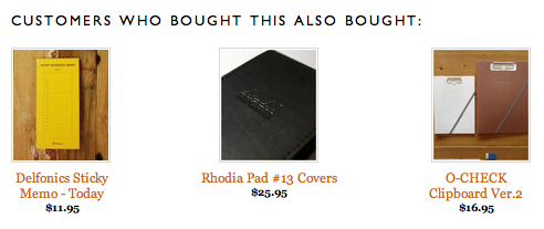
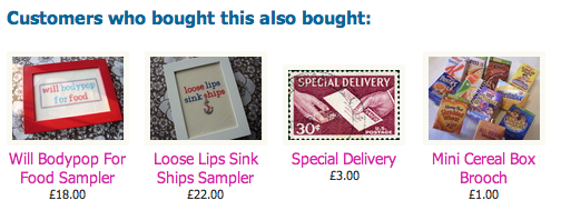
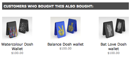
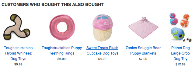
And with that, I’ll leave you with a gallery of what-this-looks-like-in-real-life shops, from the annals of our Shopify customers.


 Follow us on Twitter
 Fan us on Facebook
Matthew James Taylor:
Nice solution, but it seems like an awful lot of work just to change the spacing. Also, by adding a table you are damaging the accessibility of your page content.
Which is more important, Good accessibility or even spacing?
April 30, 2010, 11:51 pmTroy Gilbert:
@Matthew, it is an awful lot of work, that’s the whole point about CSS being broken. This is still just a few dozen lines of code that make the difference between a “meh” presentation and a pristine presentation.
And accessibility? Tables aren’t wrong. It’s a table of items, a table is actually far more correct than a generic div.
So, this seems to be a win/win — and it should have been easier!
May 1, 2010, 12:24 amMatt Brubeck:
The CSS3 solution is the Flexible Box Model. It’s been implemented in Firefox and Safari for a while now (but not IE, of course):
http://hacks.mozilla.org/2010/04/the-css-3-flexible-box-model/
May 1, 2010, 12:41 amhmm:
maybe using list elements for a start…
May 1, 2010, 1:19 amMatt Brubeck:
Hacker News user derefr suggested another pure CSS solution using inline-block that you could use today, and I tested it out here: http://limpet.net/mbrubeck/projects/justify-block.html
May 1, 2010, 1:19 amWoody Gilk:
Why wouldn’t you just do:
.box { margin-right: 10px; }
.box:last-child { margin-left: 0; }
Or, if you want IE compatibility, rather than using :last-child, use:
.last { margin-left: 0; }
Now, to be fair, this would only work when you know how many items will be on each line. Using inline-block would also be a good solution, but you will have to use JS to fix the obnoxious lack of decent CSS in IE.
May 1, 2010, 3:27 amRob Crowther:
@Troy, if it’s a table, what would the column headers be? What’s the thing which unifies the items appearing on one row (ie. what would you put as the row label)?
IMO what he has is a grid of items, not a table of items.
May 1, 2010, 4:17 amJames:
li{margin/padding-right:EQUIDISTANTVALUE;}
li.last{margin/padding-right:0px;}
doesn’t work? Ugly fix? HUH? I wish I understood more in order to understand why I’m (probably) wrong.
Ah well.
Good luck
May 1, 2010, 4:47 am-james
LaC:
If you’re going to use a table, you could also assing a width to your content cells, and put gap cells in between. The extra width will be distributed equally amongst the gap cells. HTML 2.0. (I like Brubeck’s inline-box solution more, though.)
May 1, 2010, 5:25 amTim:
I often think that CSS is great for styling, but crap for layout. The HTML & CSS combo feels like it is missing a decent layout system.
May 1, 2010, 6:23 amKassens:
Here’s a cross-browser (IE6, Chrome, Safari 4, and Opera 10 tested): http://kassens.net/even-spacing/
The markup is uglier though (using extra spacing table cells).
May 1, 2010, 8:38 amsteve:
Wow a lot of work to get them positioned right. Good work, thanks for pointing this out
May 1, 2010, 9:06 amporneL:
It’s possible even without extra elements:
ul {width:500px; text-align:justify;line-height:0}
ul:after {content:””; width:500px; display:inline-block; height:0; vertical-align:bottom}
li {display:inline-block; vertical-align:bottom; line-height:1em}
(although it exposes bugs in WebKit)
May 1, 2010, 11:05 amJohn Haugeland:
There are lots of ways to do this. None of them are pure css until css3, but lots of them are easy.
You can do this with iframe and width=”*”.
You can do this quite easily with javascript with a spacing algorithm equivalent to bresenham’s line (where the pixel height is the spacing gap.)
It’s actually quite easy with tables, if you know how many items to expect (it’s less easy, but do-able, if you don’t, by generating the CSS rule on the fly.) This example is for 5 boxes, which need 4 gaps (here’s to hoping your blog doesn’t strip code):
#tEx { border-collapse: collapse; }
#tEx td { border: 1px solid; }
#tEx td.gap { width: 25%; border-color: transparent black; }
#tEx td.box { width: 100px; border-color: black; }
Hello
Hello
Hello
Hello
Hello
In CSS3, the answer is relatively straightforward: the flexible box layout model, which basically adopts the * model from the old frames era. The code would be
#container .contain+.contain { box-flex:1.0; }
.inside { width: 100px; }
Hello
Hello
Hello
Hello
Hello
http://www.w3.org/TR/2009/WD-css3-flexbox-20090723/
Because basically nothing supports that yet, you can also hack it with CSS3 columns, which are radically more straightforward anyway, and also supported somewhat (and moreso daily).
#cols { columns: 4; width: 100%; column-width: 100px; }
#cols div { display: inline-block; }
Hello
Hello
Hello
Hello
The fastest, easiest, most backwards-compatible solution today is simple: an sized, relatively positioned container which has an event hook monitoring size changes, a series of children which are absolutely positioned but whose offsets aren’t set, and a function called onload and on size change hook that sets the offsets of said children.
It’s three lines of code. It’s radically simpler than the legitimate CSS solution. It works in all gen-3 and greater browsers (that’s right, Netscape 3 could do this.)
This isn’t a difficult problem at all.
May 1, 2010, 4:25 pmJohn Haugeland:
Of course it strips code. Let’s try entitied.
————
There are lots of ways to do this. None of them are pure css until css3, but lots of them are easy.
You can do this with iframe and width="*".
You can do this quite easily with javascript with a spacing algorithm equivalent to bresenham’s line (where the pixel height is the spacing gap.)
It’s actually quite easy with tables, if you know how many items to expect (it’s less easy, but do-able, if you don’t, by generating the CSS rule on the fly.) This example is for 5 boxes, which need 4 gaps (here’s to hoping your blog doesn’t strip code):
#tEx { border-collapse: collapse; }
#tEx td { border: 1px solid; }
#tEx td.gap { width: 25%; border-color: transparent black; }
#tEx td.box { width: 100px; border-color: black; }
<table>
<tr>
<td class="box">Hello</td><td class="gap"> </td>
<td class="box">Hello</td><td class="gap"> </td>
<td class="box">Hello</td><td class="gap"> </td>
<td class="box">Hello</td><td class="gap"> </td>
<td class="box">Hello</td>
</tr>
</table>
In CSS3, the answer is relatively straightforward: the flexible box layout model, which basically adopts the * model from the old frames era. The code would be
#container .contain+.contain { box-flex:1.0; }
.inside { width: 100px; }
<div id="container">
<div class="contain"><div class="inside">Hello</div></div>
<div class="contain"><div class="inside">Hello</div></div>
<div class="contain"><div class="inside">Hello</div></div>
<div class="contain"><div class="inside">Hello</div></div>
<div class="contain"><div class="inside">Hello</div></div>
</div>
http://www.w3.org/TR/2009/WD-css3-flexbox-20090723/
Because basically nothing supports that yet, you can also hack it with CSS3 columns, which are radically more straightforward anyway, and also supported somewhat (and moreso daily).
#cols { columns: 4; width: 100%; column-width: 100px; }
#cols div { display: inline-block; }
<div id="cols">
<div>Hello</div>
<div>Hello</div>
<div>Hello</div>
<div>Hello</div>
</div>
The fastest, easiest, most backwards-compatible solution today is simple: an sized, relatively positioned container which has an event hook monitoring size changes, a series of children which are absolutely positioned but whose offsets aren’t set, and a function called onload and on size change hook that sets the offsets of said children.
It’s three lines of code. It’s radically simpler than the legitimate CSS solution. It works in all gen-3 and greater browsers (that’s right, Netscape 3 could do this.)
This isn’t a difficult problem at all.
May 1, 2010, 4:26 pm